2026 NWSL Kit Power Rankings: Who Nailed It and Who Failed It?
The annual NWSL Kit Launch Day is more than just a merchandise drop; it’s a cultural event, a statement of intent, and a fierce battle for sartorial supremacy played out in polyester and knit. For the 2026 season, all 16 clubs have unveiled their new threads, and the results are a fascinating mix of breathtaking artistry, clever storytelling, and a few baffling missteps. We’ve scrutinized every stripe, gradient, and crest placement to bring you the definitive power rankings. From the masterpieces that deserve a spot in the Soccer Hall of Fame to the designs that left us utterly cold, here is the final verdict on who did it best.
The Pinnacle: Masterclass in Design
These clubs didn’t just release kits; they released wearable art that connects deeply with their community and identity.
1. San Diego Wave FC (Primary)
The Wave have absolutely smashed it. Their primary kit is a stunning, gradient ocean wave that transitions from a deep Pacific blue at the shoulders to a brilliant, sun-drenched teal at the hem. It’s dynamic, it’s unique, and it’s unmistakably San Diego. This isn’t just a pattern slapped on a template; it’s a fluid, beautiful representation of the club’s soul and its coastal home. The subtle shimmer in the fabric under stadium lights will be a visual spectacle. An instant classic and the clear front-runner.
2. Racing Louisville FC (Secondary)
Racing’s “Lavender Kit” returns with a powerful and poignant evolution. For 2026, the lavender hue—a tribute to the city’s iconic lavender fields and a symbol of LGBTQ+ inclusion—is darker, richer, and more vibrant. The pattern features a delicate, embossed honeycomb texture, a nod to the pollinators essential to the lavender harvest. It’s a kit that seamlessly blends local agriculture, community values, and sharp aesthetics. It tells a story you want to wear.
3. Washington Spirit (Primary)
The Spirit go bold with a majestic, regal purple base slashed by a single, diagonal sash of cherry blossoms. The sash isn’t just a block color; it’s a detailed, artistic rendering of the blossoms themselves, fading from bloom to branch. It references the city’s iconic spring event while asserting a powerful, confident identity separate from the district’s other teams. It’s elegant, fierce, and perfectly balanced.
The Solid Contenders: Strong and Stylish
These kits are excellent executions that elevate their club’s look without quite reaching the transcendent tier.
- Orlando Pride (Primary): A return to the central, vertical stripe that fans adore, this time in a radiant sunset palette of purple, pink, and orange. It’s a joyful, energetic kit that feels like Florida.
- North Carolina Courage (Secondary): A clean, “Carolina Blue” pinstripe kit that is the definition of classic. It’s crisp, timeless, and will look sharp on the pitch.
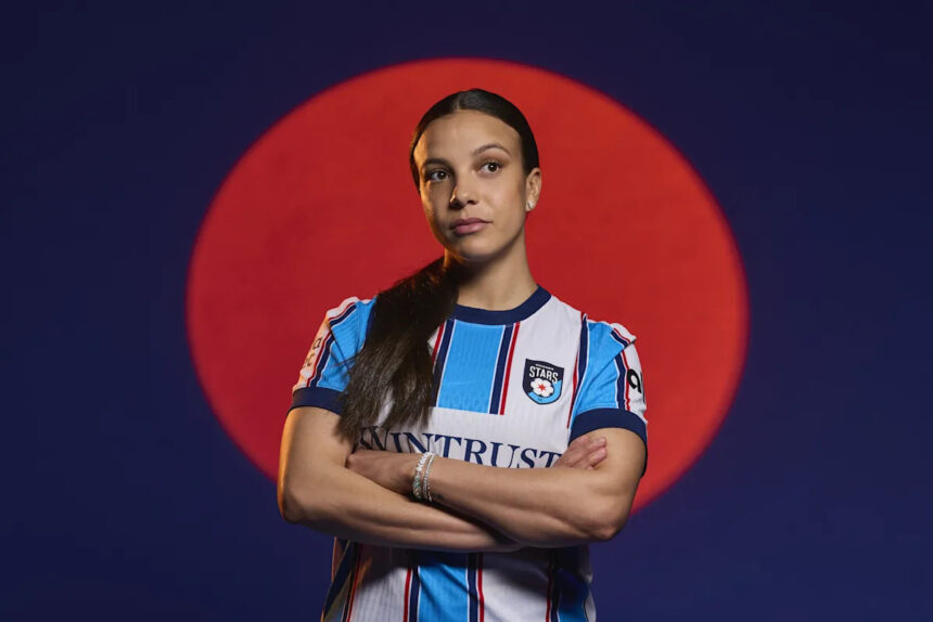
- Chicago Red Stars (Primary): A deep, crimson red kit with a subtle, all-over pattern of the city’s iconic four-star flag. It’s a much-needed return to a strong, local identity after years of bland designs.
- Bay FC (Primary): The expansion side makes a stellar first impression. Their “Heritage Kit” uses a mosaic pattern inspired by the tech industry’s circuit boards and the region’s diverse cultural tapestry. The vibrant blue and gold pop brilliantly.
The Middle of the Pack: Hits and Misses
This group is a mixed bag of good ideas with flawed execution or safe plays that won’t offend but won’t inspire either.
Gotham FC (Primary) gets points for its bold black-and-white horizontal stripes, a clear nod to New York’s subway tile. However, it feels a bit like a recycled idea from global soccer, lacking a unique Gotham twist. Portland Thorns FC (Primary) delivered a perfectly fine, deep red kit with a subtle thorn pattern, but for a club with their iconic history, “perfectly fine” feels like a letdown. We expect spectacle from Portland.
The most puzzling entry here is Kansas City Current (Secondary). Their “State Line Kit” features a bold, split design down the middle, representing the Missouri-Kansas border. It’s conceptually brilliant for the region, but the stark division is visually jarring and may not age well. It’s either a brave innovation or a gimmick—time will tell.
The Identity Crisis: Where’s the Flavor?
These kits are not necessarily ugly, but they are forgettable. They lack the distinctive local flavor that separates great kits from generic sportswear.
Seattle Reign FC (Primary) has a clean, blue kit with a subtle wave pattern on the sleeves, but it feels safe for a club reborn. Where is the fierce, rainy, evergreen identity? Angel City FC (Primary) continues with its black and pink palette, but the 2026 iteration is a simple black kit with pink trim. For a club that leads in marketing and culture, the kit design feels surprisingly conservative and template-driven.
Utah Royals FC (Primary) returns with a royal blue and gold scheme, but the design is a basic block color with minimal detailing. It fails to capture the majesty of the state’s landscapes. It’s a missed opportunity to make a grand statement upon their re-entry to the league.
The Bottom of the Table: A Kit Launch Catastrophe
We arrive at the designs that prompt head-scratching and disappointment. The conversation here is dominated by one shocking offender.
16. Denver Rapids (Secondary “Summit Snow” Kit)
If you thought the inaugural primary kit was bland and boring, the Summit Snow kit is somehow even worse. It answers the question, “We have this white shirt, what can we do with it?” with a resounding “Nothing.” It is a plain, stark white tee-shirt with a crest. The “snow” inspiration is conveyed by… well, by being white. There are no mountain textures, no subtle glacier patterns, no clever nods to Colorado’s peaks—just blankness. In a league where kits are increasingly narrative-rich, this is an astonishing abdication of design responsibility. It is the undisputed last-place finisher.
Other low-rankers include Houston Dash (Primary), which features yet another orange space-dash gradient that feels like a tired rehash, and NJ/NY Gotham FC (Secondary), a gray kit that, while intended to be “concrete jungle,” ends up looking like laundry day.
Final Whistle: What These Kits Predict for 2026
The 2026 kit cycle reveals a league confidently embracing its role as a trendsetter. The best designs prove that authentic local storytelling resonates far more than abstract templates. Look for San Diego’s gradient wave to become the league’s aesthetic benchmark, while Racing Louisville’s community-focused approach will continue to be the gold standard for meaning in merchandise.
Predictably, the kits that played it safe or failed to connect with their locale have been met with fan apathy or derision. The lesson for 2027 is clear: fans are not just buying a jersey; they are buying an identity, a piece of their city’s story, and a work of art. Clubs that understand this—like San Diego, Louisville, and Washington—will win the kit wars and deepen their bond with supporters. Those that don’t, risk being left on the shelf, both in stores and in the cultural conversation. The final score for 2026? Design: 10, Blandness: 0. The NWSL’s visual game is stronger than ever.
Source: Based on news from Yahoo Sports.