Juventus 2026/27 Home Kit: The Bold New Shirt That Marries History with Ambition
In the world of elite football, a kit is more than just a uniform. It is a statement of identity, a vessel of memory, and a promise of what is to come. For Juventus Football Club, a team that has redefined Italian style on and off the pitch for over a century, the unveiling of a new home shirt is an event that resonates far beyond the dressing room. This week, the Bianconeri and adidas have officially pulled the curtain back on the 2026/27 home kit, and it is a design that speaks directly to the soul of the club. It is a shirt that dares to look forward while keeping one foot firmly planted in the hallowed turf of the past.
This is not just another iteration of black and white stripes. This is a calculated, aesthetic statement designed to project an image of boldness, confidence, and renewed ambition. As the club navigates a new era of competition, this kit arrives as a sartorial declaration of war. Let’s break down exactly why this jersey is set to become a modern classic and what it signals for the future of the Old Lady.
The Geometry of Power: A New Take on the Iconic Stripes
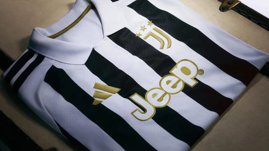
The most immediate and striking feature of the 2026/27 home shirt is its radical reinterpretation of the vertical stripe. For decades, Juventus’ stripes have varied in width, sometimes thick and imposing, sometimes thin and pinstriped. But this season, adidas has opted for a geometric precision that feels almost architectural.
The design strips away the noise. Instead of chaotic, bleeding lines, we see clean, deliberate spaces between the black and white. This isn’t a shirt that screams for attention; it commands it with quiet authority. The crisp separation of the colours projects an image of order, discipline, and tactical clarity—qualities that Juventus has historically prized above all else.
- Historical Link: The stripes pay homage to the classic 1930s and 1980s kits, but with a modern, digital-age finish.
- Visual Impact: The clean spaces create a slimming, athletic silhouette that looks faster on the pitch and sharper on the shelf.
- Psychological Edge: This is a shirt designed for a team that wants to dominate possession and control the game. It looks like a chessboard, and Juventus intends to be the one making the moves.
This is a deliberate departure from the more experimental, “off-white” and “zebra” patterns we have seen in recent years. It signals a return to a core identity, but with a sleek, modern edge. The message is clear: Juventus is shedding its recent inconsistency and rebuilding on a foundation of unshakeable structure.
The Return of Elegance: Why the Polo Collar Matters
In an era of cycling-style crew necks and aggressive V-necks, Juventus has made a bold move by bringing back the polo collar. This is not a minor detail; it is the emotional heart of the shirt. The polo collar is a direct line to the club’s golden era—the days of Boniperti, Platini, and the early years of Del Piero. It is a nod to the elegance and “classe” that has always defined the Old Lady on the European stage.
When a player pulls this shirt over his head, he is not just wearing a jersey; he is wearing the legacy of the legends who wore a similar cut. The collar adds a touch of distinction and sophistication that separates this kit from the mass-produced, generic designs of other top clubs. It suggests a team that values style as much as substance.
Expert Analysis: From a performance perspective, the polo collar offers a psychological boost. It forces the player to stand taller, to carry themselves with the poise of a champion. It is a subtle reminder that you are representing a club with a history of winning with grace. Expect to see the team’s leaders—the captain and the vice-captain—embrace this detail as a symbol of their responsibility. This collar is a statement that Juventus will not follow trends; it sets them.
Gold Details: The Alchemy of Ambition
If the stripes are the foundation and the collar is the soul, then the gold finishes are the ambition. The club crest, the adidas logo, and the player numbers all feature a subtle yet unmistakable gold trim. In the world of football kit design, gold is never accidental. It is the colour of trophies, of Serie A titles, of the Coppa Italia, and of the Champions League star that the club desperately craves to add.
This is a visual cue that this team is not just playing for points; it is playing for excellence. The gold detailing elevates the entire shirt from a piece of sportswear to a badge of honour. It catches the light under the stadium floodlights, creating a halo effect around the players. It says, “We are here to win, and we expect to win beautifully.”
- Club Crest: The gold outline around the classic J badge gives it a regal, almost ceremonial feel.
- Adidas Logo: The three stripes are rendered in gold, a rare and premium treatment reserved for elite clubs.
- Squad Numbers: The gold numbering on the back ensures that every goal scored in this kit will be etched in a colour that signifies victory.
Prediction: This kit will be a best-seller globally. The combination of the clean stripes, the retro collar, and the gold accents creates a “must-have” aesthetic for collectors and casual fans alike. I predict we will see a significant uptick in shirt sales, particularly in the Asian and North American markets, where premium design details are highly valued.
What This Kit Tells Us About Juventus’ Future
A kit is a mirror of a club’s mentality. For the last few seasons, Juventus has been in a period of transition—rebuilding its squad, redefining its playing style, and re-establishing its domestic dominance. The 2026/27 shirt is the final piece of that psychological puzzle. It is the uniform of a team that believes it is ready to return to the very top of every competition.
The design choices are not random. The geometric precision reflects the tactical discipline that manager Thiago Motta is instilling. The polo collar reflects the club’s refusal to abandon its aristocratic roots. The gold finishes reflect the financial and sporting ambition of the Agnelli family and the new board.
This is a kit that says: “We remember who we are. We know where we come from. And we are coming for everything.” It is a shirt built for the Champions League anthem, for the Derby d’Italia, and for the pressure of a Scudetto run. It is not a shirt for rebuilding; it is a shirt for conquering.
Technical Breakdown
Beyond the aesthetics, adidas has implemented its latest HEAT.RDY (or AEROREADY) technology, ensuring the fabric is lightweight and moisture-wicking. The fit is tailored but not restrictive, allowing for maximum range of motion during explosive sprints and sharp turns. The material is 100% recycled polyester, aligning with Juventus’ growing commitment to sustainability. This is a kit that performs as well as it looks.
Conclusion: A Masterpiece of Modern Kit Design
In a market flooded with derivative designs and lazy retro rehashes, the Juventus 2026/27 home shirt stands out as a genuine work of art. It successfully achieves the impossible: it is simultaneously a tribute to the past and a leap into the future. The bold stripes give it power, the polo collar gives it class, and the gold details give it purpose.
When the players step onto the pitch at the Allianz Stadium next season, they will do so wearing a shirt that carries the weight of history but feels light with potential. This is the uniform of a club that is ready to write its next great chapter. For the tifosi, it is a symbol of pride. For the opposition, it is a warning. The Old Lady has a new dress, and she looks ready to dance all the way to the trophy cabinet.
Final Verdict: 10/10. Instant classic. Buy it, frame it, and remember the season it helped define.
Source: Based on news from Yahoo Sports.