Ravens Uniforms Take Flight: A Deep Dive Into Baltimore’s Modern New Look
For 26 years, the Baltimore Ravens’ identity was forged in the image of its legendary defenses: intimidating, classic, and unyielding. That era, while forever honored, has officially given way to a new chapter. On a buzzing Thursday evening at the Merriweather Post Pavilion, the franchise unveiled its ‘Next Flight’ uniforms, a comprehensive redesign that marks the first major aesthetic overhaul since the team’s arrival in Charm City. More than a simple jersey swap, this launch was a statement of evolution, blending aggressive modern design with the deep, proud roots of Baltimore football. With reactions from fans and legends alike ringing overwhelmingly positive, the Ravens have not just changed their clothes—they’ve strategically re-tailored their visual identity for a new generation.
- The “Next Flight” Event: A Celebration of Past and Future
- Decoding the Design: Aggression Meets Modernity
- A New Arsenal: Breaking Down the Uniform Combinations
- Expert Analysis: Why This Rebrand Lands So Perfectly
- Predictions: The Impact of the “Next Flight” Era
- Conclusion: Soaring Into a Bold New Chapter
The “Next Flight” Event: A Celebration of Past and Future
The unveiling was far from a mundane press conference. Dubbed a ‘fresh start,’ the event was a full-blown spectacle that masterfully connected the franchise’s storied history with its ambitious future. A packed audience of passionate PSL holders and media witnessed a performance from cover band Go Go Gadjet, setting an energetic tone. The true emotional weight, however, came from the procession of Ravens Legends who graced the stage. Icons like Terrell Suggs, Todd Heap, Jamal Lewis, and Matt Stover served as living bridges between the team’s foundation and its new direction. Their presence signaled a crucial message: this modernization has the blessing of the very men who built the Ravens’ legacy. It was a powerful, intentional move that ensured the new look felt like an honorific progression, not a dismissal of the past.
Decoding the Design: Aggression Meets Modernity
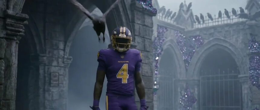
So, what exactly defines the ‘Next Flight’ aesthetic? The guiding principle, as articulated by the design team, is aggression. Everywhere you see the raven on the logo, it’s aggressive and primed to attack. This isn’t a bird perched idly; it’s a predator in motion. This ethos translates across the entire uniform system.
The primary logo has been subtly sharpened, with cleaner lines and a more dynamic posture. The wordmark font is bolder and more angular, reflecting strength. On the uniforms themselves, the most striking update is the integration of Maryland flag symbolism into the patterning on the sleeves and pants. This isn’t a overt, large-scale application but a sophisticated, textured detail—a nod to state pride that resonates on a subliminal level. The color palette remains the iconic purple, black, and metallic gold, but the execution is crisper. The stripes are sharper, the contrasts are more defined, and the overall silhouette feels streamlined for speed. The numbers feature a new custom font with bevelled edges, suggesting armor and toughness.
- Primary Helmets: The classic black helmet remains, but now features a larger, more aggressive logo on the side, maximizing its visual impact from the stands and on broadcast.
- Alternate Helmets: The team now boasts a formidable three-helmet rotation. Alongside the classic black, a stunning white helmet offers a clean, bold look for color rush games, and a legendary throwback helmet honors the franchise’s origins.
A New Arsenal: Breaking Down the Uniform Combinations
The true versatility of the ‘Next Flight’ system lies in its expanded wardrobe. Moving beyond limited combinations, the Ravens now have a dynamic toolkit that allows for significant visual variety while maintaining a cohesive brand identity.
Baltimore has three helmets and two alternates at their core, which mathematically unlocks numerous fresh looks. The home uniform remains a deep, majestic purple, but with the modernized details discussed. The away whites are arguably the standout, offering a pristine, sharp canvas that makes the purple and black accents pop with incredible clarity on television. The all-black look becomes even more intimidating, fully embodying the team’s defensive mentality.
The introduction of the white helmet is a game-changer. Paired with the white jerseys and pants, it creates a monochromatic “storm” look that is both unique and fearsome. Furthermore, the ability to mix and match the new pants stripes with different jersey and helmet combinations—like the black helmet with white jerseys and black pants—gives the team a level of sartorial strategy it has never possessed before. This modular approach keeps the team’s visual presentation fresh throughout the season and allows for specific branding for prime-time games or crucial divisional matchups.
Expert Analysis: Why This Rebrand Lands So Perfectly
From a design and branding perspective, the Ravens’ rollout is a masterclass. In an era where NFL uniform changes can often be met with derision for being too gimmicky or straying too far from tradition, Baltimore threaded the needle perfectly. The changes are significant and modern, yet deeply respectful. The incorporation of state iconography through the Maryland flag pattern is a genius-level touch that fosters local connection without resorting to cliché.
Critically, the uniforms look fast. The streamlined stripes, tapered patterns, and bold numbers are designed for the modern athlete’s physique and the high-speed nature of today’s NFL. They project velocity and power. Furthermore, the commitment to a multi-helmet system is a savvy embrace of a new NFL policy, giving fans more to collect and discuss. By involving legends so prominently, the team mitigated any potential nostalgia-based backlash and framed the change as a collective step forward for the entire Ravens community.
Predictions: The Impact of the “Next Flight” Era
The immediate impact is already visible in the electrified fanbase. Merchandise sales for the new designs are projected to shatter records, as both longtime fans and a new generation seek to own a piece of this new era. On the field, the uniforms provide a tangible sense of a new identity. For a team with a revamped offense and a always-formidable defense, looking like a new, sharper entity can psychologically contribute to a “new season, new us” mentality.
We predict the all-white and all-black combinations will become among the most feared and iconic looks in the league, especially under the lights. The ‘Next Flight’ brand will dominate local marketing and define the team’s visual presence for the next decade or more. Furthermore, this successful rebrand may pressure other classic, static franchises in the league to consider thoughtful evolutions of their own, potentially starting a new wave of NFL aesthetic updates that prioritize modern functionality without erasing history.
Conclusion: Soaring Into a Bold New Chapter
The Baltimore Ravens’ ‘Next Flight’ uniform launch was more than a fashion show; it was a definitive statement about the franchise’s trajectory. By marrying an aggressive, forward-thinking design with a profound reverence for its history, the team has achieved a rare feat: a rebrand that satisfies traditionalists and modernists alike. The new looks are crisp, intimidating, and rich with local symbolism, designed for both the speed of the game and the passion of the city. As the Ravens prepare to take the field this fall, they will do so not just as a football team, but as a visually unified symbol of Baltimore’s relentless spirit, primed to attack the future while forever honoring the legendary flights of the past.
Source: Based on news from Yahoo Sports.