Five Charts That Explain How England’s Ashes Dream Died in 11 Days
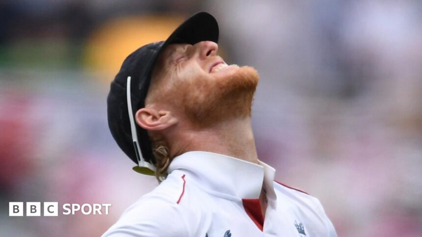
For England, an Ashes tour in Australia is a journey into a particular kind of sporting purgatory. The hope that travels with the team on the long flight south is systematically dismantled by pace, bounce, and relentless pressure under the fierce Antipodean sun. The 2021-22 series was no different, perhaps even more brutal in its efficiency. In just 11 days of actual cricket, across three Tests in Brisbane, Adelaide, and Melbourne, Australia secured the urn, leaving England to play for pride and future places. The story of this crushing defeat isn’t just written in the scorelines; it’s etched in the cold, hard data. Using insights from leading analysts CricViz, we reveal the five definitive charts that show how England’s Ashes campaign unravelled so spectacularly.
The Batting Chasm: A Failure to Adapt
The most glaring disparity between the two sides was not just in runs scored, but in how they were scored. England’s batting philosophy, caught between aggression and attrition, failed catastrophically in Australian conditions.
One chart tells this story perfectly: Batting Attack Percentage. This metric measures how aggressively a batter is looking to score. For the first three Tests, England’s top seven batted with an average attack percentage of just 14%. In stark contrast, Australia’s top seven operated at 21%. This seven-point gap is a canyon in Test cricket terms. It reveals an England side petrified of driving, hesitant on the front foot, and utterly unable to shift pressure back onto the bowlers. They were stuck, waiting for the mistake that never came from the impeccable Australian attack.
- Defensive Mindset: England’s low percentage shows a survival-first approach, which is fatal on true Australian pitches where bowlers build pressure.
- Australian Intent: Australia’s higher rate wasn’t reckless slogging; it was proactive scoring, using the pace of the ball and punishing width.
- Pressure Valve: By scoring more freely, Australian batters consistently broke the shackles England’s bowlers tried to apply.
The Kookaburra Ball Curse: England’s Bowling Inefficiency
England’s bowlers toiled manfully, but a critical chart highlights their fundamental lack of threat with the new ball: Average Swing in the First 20 Overs. Despite ideal overhead conditions at times, England’s seamers managed to generate an average of just 0.74 degrees of swing in the crucial first two sessions. Australia’s attack, masterfully led by Pat Cummins and Mitchell Starc, averaged 1.03 degrees.
This difference, nearly 0.3 degrees, is the difference between beating the bat and nicking the bat. England’s inability to make the Kookaburra talk early allowed Australian openers David Warner and Marcus Harris—and later Usman Khawaja—to settle. Without early swing, the plan devolved into a war of attrition England’s batters had already lost. The failure to master the primary weapon in Australian conditions condemned them to always be playing catch-up.
The Catches Win Matches Catastrophe
Dropped catches are a symptom of a struggling team, and England’s were both chronic and costly. A chart plotting Expected Catches vs Actual Catches in the series is damning. Based on the difficulty of chances offered, England were expected to hold onto approximately 85% of their catches. Their actual success rate plummeted to a dismal 68%.
This wasn’t bad luck; it was a failure of skill and concentration under fire. Key reprieves were handed to David Warner in Brisbane, Marnus Labuschagne in Adelaide, and others at critical junctures. Each drop was a psychological blow to the bowlers and a gift of momentum to Australia. In a series defined by fine margins at the start of each Test, these errors were a form of self-sabotage England could ill afford.
The Run Rate Reality: Scoring Under Pressure
Another chart exposes the tempo of the two teams’ innings: Run Rate per Session. Across the first three Tests, England’s run rate rarely climbed above 3 runs per over, often stagnating below 2.5 in middle sessions. Australia, meanwhile, consistently maintained rates above 3.2, with spikes above 4.0 when they seized control.
This chart illustrates the scoreboard pressure England were constantly under. When they batted, they crawled, building pressure on themselves. When Australia batted, they scored at a healthier clip, ensuring that even if England took a wicket, the scoreboard had advanced. This pressure directly fed into England’s batting collapses, as batters felt the weight of dot balls piling up. They were outplayed in the fundamental game of managing the game clock and the scoreboard.
The Collapse Correlation: Wickets in Bunches
The final, most painful chart is a simple wicket timeline. It doesn’t show steady decline; it shows devastating, vertical cliff-falls. England lost 3 wickets for 7 runs in Brisbane, 8 wickets for 86 in Adelaide, and suffered the infamous All Out for 68 in Melbourne.
This pattern reveals a fragile mentality. One wicket brought two, and two brought three. The middle order, from Haseeb Hameed to Jos Buttler, was unable to stem the tide. The chart shows no resilience, no partnership long enough to blunt the attack. Australia’s bowling chart, conversely, shows wickets spaced out, with partnerships broken just as they were becoming dangerous. England’s innings lacked the spine of a single, match-defining partnership when it mattered most.
Looking Ahead: Rebuilding or More Ruin?
The data presents an unequivocal verdict: England were out-skilled, out-thought, and out-fought in every fundamental department. For the future, the questions are profound. Does this data demand a complete philosophical overhaul, or simply better execution of existing plans?
Prediction for the Future: The charts suggest a need for a radical shift. Selecting players with games suited to Australian conditions—front-foot players who can score—is non-negotiable. The bowling attack must find a way to be potent with the Kookaburra, which may require new faces or a drastic change in technique. Without addressing these data-proven flaws, the 2025-26 tour risks being a haunting rerun of this one.
Conclusion: A Story Told in Numbers
The Ashes were not lost in a single moment of madness or a rogue delivery. They were lost in the cumulative weight of these five charts. They were lost in tentative prods, in balls that didn’t swing, in catches that hit the floor, in scoreboards that stalled, and in clusters of wickets that betrayed a fragile mindset. For England, the path forward is clear: the data from this humiliation must become the blueprint for redemption. Until they can change the trends in these charts, the Ashes in Australia will remain a dream deferred, dying a little more with each passing session under the relentless Australian sky.
Source: Based on news from BBC Sport.